
Project Hub
More
Alerts are account-scoped
Alert rules, channels and delivery history belong to your stack. Sign in with GitHub to configure them — nothing is fillable or clickable until then.
How to kill AI slop: give your agent a design vocabulary
It always starts the same way. Friday night, an idea, a fresh repo, one prompt: "build me a nice landing page." By Sunday you have a working MVP and a page that feels... familiar. Not yours. You have seen it before, on four other products this week.
Inter everywhere. A purple-to-blue gradient on the hero. Three identical cards with an icon floating above each. Gray body text sitting on a colored panel, at 3.1:1 contrast. A rounded-square emoji before every heading. This is AI slop: not broken code, just the average of everything the model ever read — served back to you at speed.
The usual rescue attempt is typing "make it pop". That sentence contains zero information, so the agent guesses, and the guess is more purple.
Full disclosure: I build Frankenstack, a monitoring cockpit — not a design tool. I have no connection to the tool below and there are no affiliate links here. I have not yet run it against this site; the point of this post is the method, and I would rather describe it accurately than pretend to a before-and-after I have not done.
The tells, in one list
Print this and tape it to your monitor. Every one of these is a decision the model made for you:
- A gradient applied to text, or a gradient background with no source of light in the page.
- Cards inside cards, because padding felt like a personality.
- Gray text on a colored surface — the single most common accessibility failure I see shipped.
- The same border radius on every element, so nothing reads as more important than anything else.
- An icon above every heading, chosen by keyword association rather than meaning.
- Three feature cards of equal length, because the grid was easier than the argument.
- Copy that says "seamless", "elevate", "empower", "unlock" — a model's way of saying nothing.
You can catch most of that by eye. The problem is that by hour nine of a build, your eye stops working — which is exactly the state agents are worst at judging, since the agent that wrote the page is the last entity on earth that will call it generic.
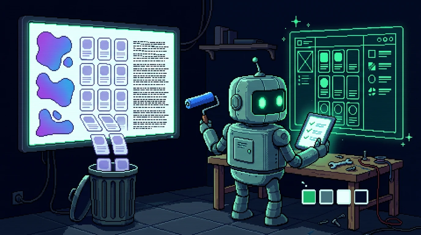
What Impeccable is
pbakaus/impeccable is a local toolkit for coding agents. One install from the project root, and your agent (Cursor, Copilot, Claude Code, Codex, whatever is on the desk this month) gets 24 specific design commands instead of a mood. No account, no dashboard, no subscription, and — this is the part that matters — no API key needed for the rule engine.
It installs into the project, which means it travels with the repo: a fresh session in six weeks still has the vocabulary available, long after you forgot what you meant by "cinematic spacing".
1. A deterministic slop detector
The core is 62 fixed rules, run without an LLM. That is the whole trick: a linter, not a critic. A linter can tell you the body text is 13px, that the heading jumped from h1 to h4, that the padding collapses below 640px, that the color pair computes to 2.9:1. Those are facts, so they cost zero tokens and always return the same answer.
Asking an agent "is this design good?" costs money and gets you flattery. Asking a rule engine "is this heading hierarchy legal?" costs nothing and gets you a number. The detector runs over generated UI files and hands findings back before the agent can declare the task done — which is precisely where the flattery usually starts.
2. Steering with words that mean something
The commands are the interesting part, because they replace adjectives with directions:
bolder— add weight and character where the design played it safe (one hero, not the whole page).quieter— pull back shadows, borders and competing accents when the page starts shouting.distill— delete components the interface does not need. The one that saves the most pages.
"Make it pop" fails because it describes your feeling; these describe a delta the agent can apply and you can see.
3. Critique and audit, graded
critique scores the current design against usability heuristics and orders the fixes. audit is the technical pass: accessibility, rendering performance, responsive behaviour, ranked P0 (blocking) to P3 (polish). The ranking is the useful bit — a list of 40 issues sorted by severity is a work plan; a list of 40 issues is a mood.
4. Live mode: change it where you can see it
live attaches an overlay to your running dev server (Next.js, Vite, Astro, SvelteKit, plain HTML). You click the element, pick a direction, and it hot-swaps variants in the browser; accept one and it is written back to source. This is the only workflow that beats describing a layout in a prompt, because you are choosing between things you can actually see instead of adjectives you can picture differently than the model does.
5. PRODUCT.md and DESIGN.md: constraints instead of vibes
On first run it reads the codebase and writes two context files: what the product is, and what the design system is. Every later command uses them as guardrails. This is the same pattern as an AGENTS.md: write the decisions down once, and the agent stops re-inventing them every session. If you have ever watched an agent switch your spacing scale halfway through a feature, you know why that matters more than any single command.
Where it will not save you
Four honest limits, because a tool review without them is an advert:
- Rules catch tells, not taste. A page can pass all 62 and still be boring. Nothing in a linter knows your product's one job.
- Most slop is a message problem. Generic layouts fail because the copy says nothing, and no design command writes your argument for you.
- "Zero token burn" is about the detector, not the whole loop. The commands that call a model still call a model.
- It is one more dependency in the repo. Small, local, but real — and the results are only as good as the review habits around it.
The ten-minute routine I am adopting
auditbefore a deploy, not after a launch.distillon the pricing and feature sections — the two places that always grow.bolderon the hero only, then stop.- Check every new color pair in light mode on a real screen. Our own light theme shipped an emerald accent that was invisible on white until a screenshot caught it — a rule engine would have flagged that instantly, and it is the kind of thing nobody re-checks by hand.
- Open the page on a phone, one last time, before the deploy that matters.
The point is not the tool. The point is that a design decision per page — one message, one hierarchy, one accent — is what actually separates a product from a model's average. A vocabulary just makes that decision cheap enough to enforce at 2am, when the alternative is "make it pop" and another purple gradient.
If you try it on your own stack, that is what we want to hear about: which commands earned their place, and which just moved the padding around. Send it to support@frankenstack.app.